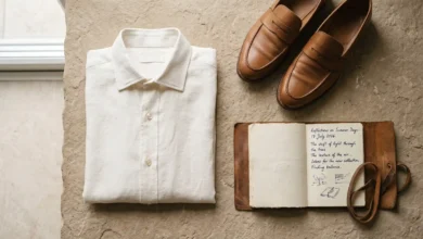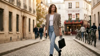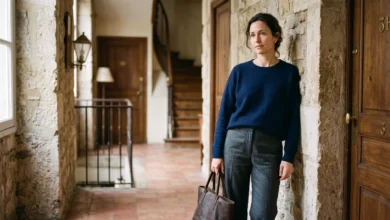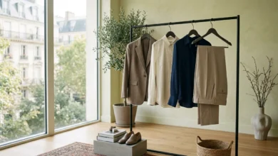
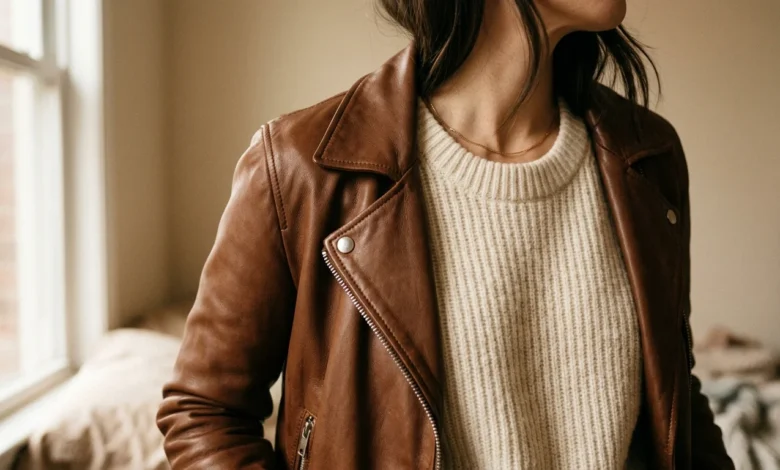
Stand in front of a mirror wearing head-to-toe cotton twill, matched color, good fit, nothing wrong with it, and the outfit still reads a little flat. If you are wondering how to mix textures in an outfit, swap the shirt for a knit and the flat-front trousers for something with a visible weave—the same color story suddenly looks considered instead of accidental. Nothing about the fit changed. The surfaces did.
Color gets most of the credit in outfit planning, and fit gets the rest. Texture is the variable most people never touch on purpose, which is exactly why the people who do it well look like they put in more effort than they actually did. It is not a rule about matching. It is a rule about contrast.
The short version: mix textures by choosing one dominant surface to lead the outfit, pairing it with a maximum of two supporting textures that sit in a different weight or finish category (matte against shine, rough against smooth, structured against fluid), keeping the color palette tight enough that fabric is doing the visual work instead of pattern or hue, and stopping before a third or fourth reflective or heavily textured piece turns the look busy instead of intentional.
Why Texture Carries More Weight Than People Assume
Fabric surface is not just a finishing detail. A 2024 study published in the Textile Research Journal asked twenty people to rate ten fabric samples twice, once by sight alone and once with sight and touch combined, and found that the emotional read of a fabric shifted once touch entered the picture, not just the visual impression of it. Separate research examining twenty-two textile swatches concluded that a person’s own tactile sensitivity changes how they judge a fabric’s texture in the first place, which is one reason two people can handle the same jacket and one calls it luxurious while the other calls it stiff.
None of that requires a design degree to use. It means a reader’s instinct that an outfit looks slightly wrong even when the colors match is usually a texture problem, not a color problem, and it is fixable with the same amount of effort as picking a better color.
Lead With One Texture, Not a Whole Outfit of Them
The outfits that read as effortlessly put-together almost always have one texture doing the talking, whether that is a shearling collar, a satin skirt, or a heavily ribbed corduroy blazer, while everything else stays quieter. Trying to make three or four fabrics compete for attention at once is what turns a deliberate mix into visual noise.
A dependable starting formula: pick the piece with the most obvious surface interest first, then build around it with one or two supporting textures from a different family. If the lead piece is smooth and reflective (leather, satin, a polished wool), pair it with something matte and textured (a cotton poplin shirt, a nubby knit, brushed cotton). If the lead piece is rough or heavily textured (corduroy, boucle, raw denim), pair it with something smoother to let the texture read clearly instead of competing with another busy surface.
At a Glance: Two Reliable Contrast Patterns
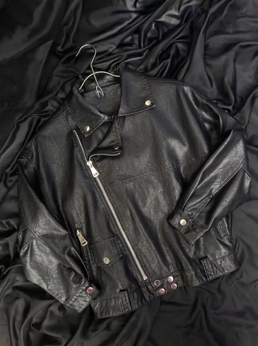
- Matte against shine: a cotton poplin shirt under a leather jacket, or a wool coat over a satin slip.
- Rough against smooth: corduroy trousers with a silk or crepe top, or a boucle jacket over a fine merino knit.
- Both patterns work with a tight, one-to-two-color palette; neither works if every piece is also fighting for attention through pattern or color.
- Pick the pattern based on which single piece already has the most surface interest, then let it lead.
Weight Is the Variable Most Advice Skips
Fabric weight, not just fiber name, decides whether two textures actually contrast or just cancel each other out. Two fabrics with different names but a similar weight and stiffness will still read as one flat surface from a distance. Weight is measured in grams per square meter (GSM) or, in the American denim and workwear industry specifically, ounces per square yard, and the two scales convert directly: one ounce per square yard works out to about 33.9 grams per square meter.
Denim is the clearest example because the industry is unusually precise about it. Denim under roughly nine ounces per yard has enough give to work as a shirt or skirt fabric, while the ten-to-thirteen-ounce range is what most standard jeans are cut from. Corduroy runs a wide spread depending on the wale (the width of the ribs), with lighter needlecord sitting well under heavier, wide-wale corduroy that can weigh two to three times as much for the same size garment. That spread matters practically: a lightweight needlecord shirt pairs easily with a fluid silk skirt, while a heavy wide-wale corduroy blazer needs a similarly substantial partner or it will simply overwhelm something delicate.
| Fabric | Typical Weight Range | How It Reads in a Mix |
|---|---|---|
| Silk charmeuse or satin | Light, fluid, close-draping | Adds shine and movement; needs a sturdier partner to avoid looking slight |
| Cotton poplin | Light to mid-weight, crisp | Holds a clean line and a crease; a dependable neutral base for a bolder texture |
| Mid-weight denim | Roughly 10 to 13 ounces per yard | Rigid and matte; grounds anything fluid or shiny paired with it |
| Corduroy | Wide range depending on wale width | Visible ribbing reads from a distance; match its weight to its partner or one will dominate |
| Wool flannel or coating | Heavy, insulating | Absorbs light instead of reflecting it; a strong counterweight to satin or leather |
Pairings Worth Building a Wardrobe Around
Some texture combinations show up in well-put-together outfits again and again because the contrast is doing real visual work, not because they are trendy. A few that hold up across seasons and budgets:
| Pairing | Why the Contrast Works | Where It’s Useful |
|---|---|---|
| Leather and a fine knit | A smooth, light-catching surface set against something matte and textured | Evening looks and dressed-up weekend outfits |
| Corduroy and silk or crepe | A ribbed, matte fabric grounds something fluid and reflective | Office looks that need to move into evening |
| Denim and a soft drape | Rigid twill against something that moves independently of the body | Weekend-to-dinner transitions |
| Wool coating and cotton poplin | A heavy, insulating surface against something crisp and light | Layered fall and winter dressing |
| Linen and a smooth knit | A nubby, breathable weave against something cool-handed and even | Warm-weather layering without overheating |
Category pages that already cover fabric performance in detail, like the fabrics that actually breathe in summer heat, are worth cross-referencing before buying into a pairing for a season it was never built for. A silk-and-wool combination that looks elegant in October will not behave the same way in July.
Where This Advice Falls Apart
Texture mixing has real limits, and pretending otherwise is how advice like this starts to feel dishonest. It does not work if the entire wardrobe is built from a similar mid-weight synthetic blend, because the surface finish that creates contrast (matte versus shiny, smooth versus nubby) often has less to do with the fiber name on the tag than with how tightly and finely it was woven or knit, and a lot of budget fast fashion is finished to a similar flat sheen regardless of what the label says the fiber is. In that case, the fix is not more textures. It is one or two pieces with genuinely different surface finishes, even if that means buying fewer things.
It also breaks down past a certain point of density. Two or three genuinely different surfaces in one outfit reads as intentional. A sequin skirt with a patent leather jacket and a satin blouse does not read as advanced texture mixing; it reads like a costume, because too many reflective, high-contrast surfaces compete for the same visual attention instead of taking turns.
If You’re Building This Skill With What You Already Own
Before buying anything new, an honest closet audit usually turns up more texture variety than expected, just never worn together on purpose. A cotton poplin button-down and a corduroy skirt bought in the same season for different reasons will contrast just as well as two pieces bought specifically to be worn together.
If You’re Shopping With One New Piece in Mind
Buy the texture that is currently missing from the closet, not the color. A wardrobe with plenty of cotton, denim, and knit but nothing with visible shine or a raised weave (corduroy, boucle, a substantial leather piece) will get more mileage from that one addition than from another matte basic in a new shade. This is also where a documented approach to building a repeatable personal style formula pays off, since a formula that already accounts for texture as a deliberate variable makes each new purchase easier to place.
If Everything Is Already the Same Weight and Finish
This is the fast-fashion problem described above, and the fix is not dramatic. One heavier, more textured piece, a real corduroy or a substantial knit, changes the read of everything already in the closet without requiring a full wardrobe overhaul. An oversized blazer with real drape, the kind covered in how to style an oversized blazer without it wearing you, is a common example of one piece doing that work for an entire rotation of otherwise similar basics.
Frequently Asked Questions About Mixing Textures in an Outfit
Does mixing textures still work with a limited color palette?
Yes, and a tight palette usually makes it easier. When color is not competing for attention, the eye reads surface contrast more clearly, which is why so many well-executed texture-mixed outfits stay within one or two colors.
How many different textures is too many for one outfit?
Two to three genuinely distinct surfaces is the reliable range. A fourth, especially if it is also reflective or heavily textured, tends to tip the balance from intentional into busy.
Can texture mixing work in a business casual setting?
Yes, and it often reads as more polished than a single flat fabric, provided the contrast stays subtle. A wool trouser with a crisp cotton poplin shirt is already a mild version of the same principle used in more casual outfits.
Do heavier, rougher textures like corduroy work in warm weather?
Only in their lighter weights. A fine needlecord or lightweight corduroy behaves differently than a heavy wide-wale version, and matching the weight to the season matters as much as matching the surface to a partner fabric.
The Actual Takeaway
Texture is the least expensive upgrade available to an outfit that already fits and already matches in color, because it does not require new pieces so much as new pairings of pieces already owned. Start with the one item that already has the most obvious surface interest, build one or two supporting textures around it from a different weight or finish family, and stop before a third reflective or heavily textured piece turns the outfit into something louder than it needs to be.
Sources
Research Sources
Textile Research Journal (SAGE Publishing): Modeling the Relationship Between Fabric Textures and the Evoked Emotions Through Different Sensory Perceptions, Accessed July 2026.
PMC, National Library of Medicine: Tactile Sensitivity Alters Textile Touch Perception, Accessed July 2026.
Industry Sources
Dalston Mill Fabrics: Understanding Denim Weights: Denim Weight Conversion Tool, Accessed July 2026.
The Fabric Index: Fabric Weight Guide: What the Numbers Mean, Accessed July 2026.
Additional Reading
MasterClass: How to Create Outfits by Mixing and Matching Clothing Textures, Accessed July 2026.